Logos
The Verkada Logo consists of two elements — the Symbol and the Wordmark — that work together to form the primary visual expression of our brand. Its purity and simplicity complement our dynamic, sophisticated graphic language.
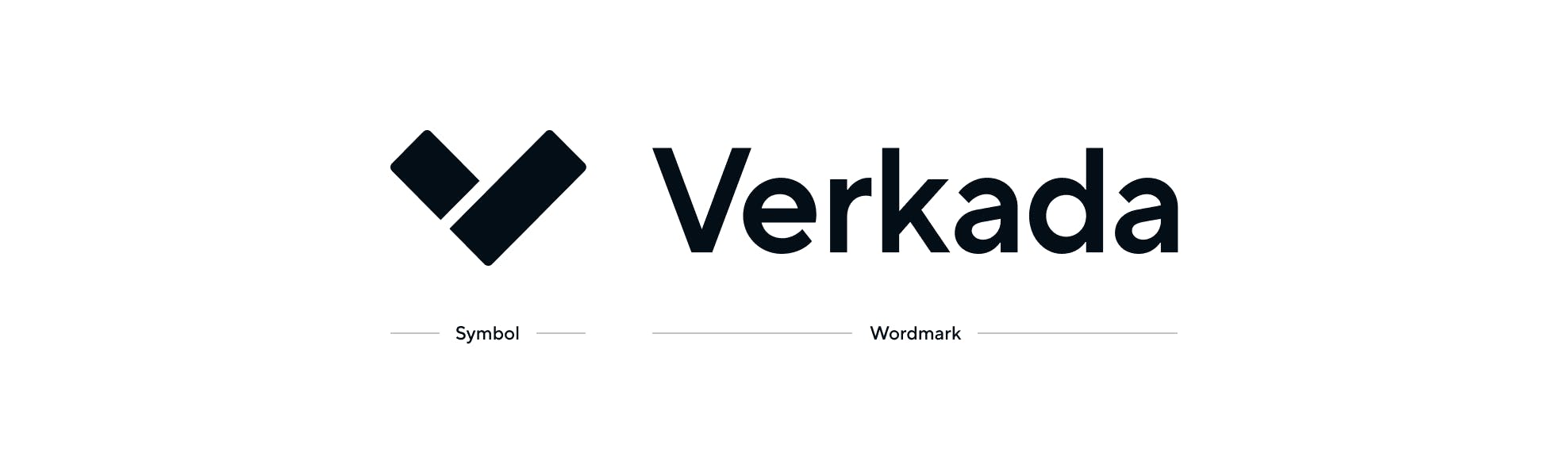
Symbol
Sleek and accessible, our Symbol — a bold, stylized “V” — represents Verkada’s seamless integration of hardware and software.
Wordmark
Our Wordmark has been carefully crafted to work in perfect harmony with the Verkada Symbol. The letterforms of the Wordmark have been thoughtfully typeset and scaled for optimal balance and complement the forms of the Symbol. A thoughtfulness and precision of craft results in a logo that is both legible and sophisticated.
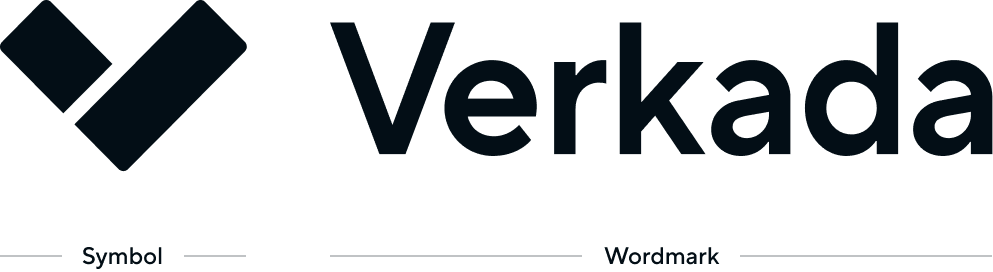
Logo Configurations
Two logo configurations have been createdfor use in print and digital applications.
Preferred (Horizontal) Logo
The preferred configuration features the symbol staged next to the wordmark, which is scaled for optimal brand impact. This horizontal configuration should be used whenever possible.
Alternate (Vertical) Logo
The alternate configuration may be used only in situations where space limitations don’t allow for use of the preferred logo. It is important to always use the artwork as provided. Never modify the logos.
Logo Clear Space
Clear space is the area surrounding the entire logo. It must be kept free of any visual elements, including text, graphics, borders, patterns and other logos.
Preferred (Horizontal) Logo
Clear space is measured in relation to “X,” which equals the x-height of the wordmark.
Alternate (Vertical) Logo
Clear space is measured in relation to “X,” which equals the x-height of the wordmark.
Logo Color Variations
The Verkada Logo is available in two color variations — Black and Reverse. The Black variation of the logo is the primary expression of our brand. However, because black is used so often in our identity system as a background color, the Reverse variation is also widely used. Both logo variations are available in RGB, CMYK and Pantone® spot color.


Logo Incorrect Usage
The Verkada Logo is custom drawn. Never recreate it or its elements. The examples shown to the right illustrate uses that should be avoided. The same usage rules apply to all versions of the logo. Always use the logo artwork as provided. Never modify it.


Symbol
Our Symbol is iconic in its bold simplicity. At first glance, the Symbol represents the “V” letterform from the Verkada logo, but our Symbol is also imbued with deeper meaning. The two components signify our integration of protection hardware and software.
In special circumstances, the symbol may be used as a stand–alone graphic for optimal impact. However, the complete Verkada identity must also be used somewhere within the same layout for reference.

Symbol Clear Space
Clear space is the area surrounding the entire symbol. It must be kept free of any visual elements, including text, graphics, borders, patterns and other logos. Clear space is measured in relation to “X,” which equals the height of the symbol.
Minimum clear space should be equal to or greater than 1/2X on all four sides of the symbol.
Color
The Verkada Logo consists of two elements—the Symbol and the Wordmark—that work together to form the primary visual expression of our brand. It's purity and simplicity complement our dynamic, sophisticated graphic language.
Brand Colors
The Verkada Color Palette is primarily neutral. White and blue are featured prominently throughout for a sophisticated, premium, technical aesthetic, and is supported by a range of shades. To achieve a balanced, visually harmonious layout, use the Verkada Color Palette according to the ratios shown on this page. Always lead with white. Light grays may also be used as backgrounds to create balance.
Signature Colors
Neutrals off–white
#f7f9fb
Blue 600
#007FAF
Blue 800
#15374C
Neutrals off–black
#030E16
Brand Palettes
Blue
White
#FFFFFF
Blue off–white
#F3FBFE
Blue 10
#E1F5FC
Blue 25
#CFEFFB
Blue 50
#BDE9FA
Blue 75
#A9E3F8
Blue 100
#95DDF7
Blue 200
#7ED6F6
Blue 300
#63D0F5
Blue 400
#3AC1EB
Blue 500
#19A0D5
Blue 600
#007FAF
Blue 700
#115274
Blue 800
#15374C
Blue 900
#002033
Neutrals off–black
#030E16
Neutral
White
#FFFFFF
Neutrals off–white
#F7F9FB
Neutrals 10
#EFF3F7
Neutrals 25
#EAEFF3
Neutrals 50
#E6EAEE
Neutrals 75
#DCE0E4
Neutrals 100
#CDD1D7
Neutrals 200
#B0B6BE
Neutrals 300
#949CA5
Neutrals 400
#838E98
Neutrals 500
#73808C
Neutrals 600
#536573
Neutrals 700
#3F515F
Neutrals 800
#2C3E4C
Neutrals 900
#192630
Neutrals off–black
#030E16
Expanded Colors
Accent colors are used in vast number of instances with varying needs.
Red 500
#DE3243
Red 700
#B01D2B
Green 400
#26cc86
Yellow 400
#FFAB40
Purple 600
#893DCD
Orange 500
#FF5500
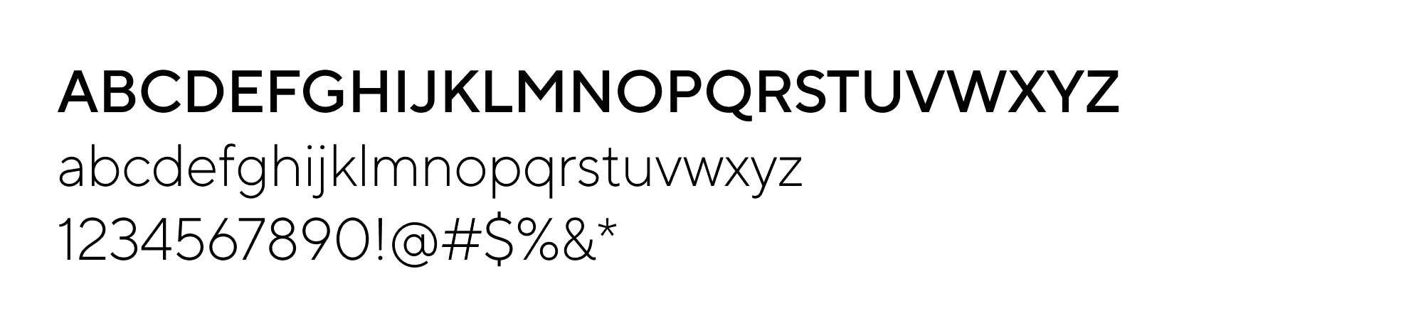
Typography
TT Norms Pro is a clean and geometric sans serif typeface that is equipped with many stylistic alternatives and extended features. It comes in 11 weights from Thin to ExtraBlack and matching italics.
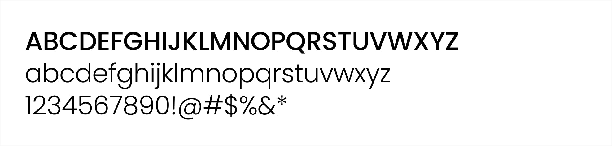
Primary Typeface
TT Norms Pro
TT Norms Pro is Verkada’s primary typeface. It should be used for titles, headers, body copy and captions.
Alternate Typeface
Poppins
Poppins is Verkada’s alternate typeface, which can be used when the primary typeface is not available.
Type Usage
Our typographic style is clean, simple and sophisticated, with a technical look and feel. A range of type weights brings flexibility and unity to our digital and printed communications. Information hierarchy is established across different levels of information through contrasting sizes, weights and colors, creating a look that’s eye–catching and aesthetically pleasing.
Digital AD Header
(1200x628)
Weight: Regular Size: 45pt Line Height: 55pt 
Digital AD Eyebrow
(1200x628)
Weight: DemiBold Size: 25pt 
Digital AD CTA
(1200x628)
Weight: DemiBold Size: 25pt 
Document Main Title/Header
(Letter size)
Weight: Light Size: 16pt Line Height: 20pt 
Document Section Title
(Letter size)
Weight: Light Size: 11pt 
Document Body
(Letter size)
Weight: Regular Size: 9pt Line Height: 12pt 
Document Body Title
(Letter size)
Weight: Light Size: 9pt 
Iconography
As visual symbols, Verkada icons represent ideas, objects or actions. They can communicate messages at a glance, afford interactivity and draw attention to important information.
General Icons
The square grid is the underlying fabric of all Verkada icons and is used as the foundation to determine line thickness, proportion, shape and positioning across the entire set of icons.
The grid helps guide design decisions, which helps ensure a unified approach. More importantly, it allows flexibility in creating the appropriate shape needed to communicate the right idea.

Camera

Access Control

Air Quality Sensors

Alarm

Verkada Guest

Mailroom

Door Controller

Alarm Panel

All-in-one Command

Auto Update Access Control

Solid State Drive

PoE Access Control

SV20 Tamper

Install Cameras

Add Device

Panic Pair Camera

Camera Integration

Easy Connection

Face blur

Person of Interest

Appearance Search

License Plate Recognition

Door Access Via Mobile

Remote Arming